Visit: SESC Pompéia

SESC Pompéia | Lina Bo Bardi | 1977-1986 | São Paulo | 24/08/2016

This disused industrial warehouse was renovated to create a new cultural and sports complex. The design was treated as two parts, the existing factory buildings and the new-build concrete towers, connected by the public space between them. The original factory buildings were stripped back to their structure and building fabric, with new additions inserted to encourage a diverse social interaction and ‘architecture for all’. The concrete towers provide space for sporting activity with two towers connected by elevated concrete walkways and a third ‘chimney’.

FACTORY SPACES

The retrofitted spaces are stripped back to their envelope and concrete structure, with various interventions to the spaces to allow eating, sitting, talking, walking, reading – centred around “Culture as a shared life experience, free-choice, freedom for gatherings and meetings.” Lina Bo Bardi. The new concrete interventions and timber furnishings change the spaces by creating changes in height and changes in spatial experience.

CONCRETE TOWERS

The three concrete towers added are:

  • The water tower to symbolise the old chimney of the factory that was previously demolished and to act as a marker of the site.
  • A narrow concrete block with changing rooms, small gymnasium spaces and vertical circulation.
  • A larger concrete block, connected to the other via external concrete walkways, contains a swimming pool and two levels of sports halls, which are naturally ventilated through large irregular openings which also offer views out to the city.

The material palette to the interventions unify the two parts of the complex with the raw concrete and red details signifying the architect’s changes. The openness and inclusive use of the cultural spaces in the factory buildings are in line with the manifesto of SESC, however, the sports complex is only open to members and do not offer tours or access to visitors to arguably one of the country’s most important and famous modern buildings.

Visit: Faculdade de Arquitetura e Urbanismo da Universidade de São Paulo (FAU-USP)

Faculdade de Arquitetura e Urbanismo da Universidade de São Paulo (FAU-USP) | João Vilanova Artigas & Carlos Cascaldi | 1961-1969 | São Paulo | 23/08/2016

The Faculty of Architecture and Urbanism at the University of São Paulo, is a critical building to the understanding of Brutalism in Brazil. The building demonstrates various key points which all contribute to what makes a building brutalist (within the Brazilian context) as well as being the institution in which professors and students shared their ideas and opinions.

The building is an extension of the public space it sits in, with no threshold as you enter – only a change of height as you pass under the concrete level above and are released into the full-height naturally-lit atrium. The spatial continuity of the buildings is seen in its circulation which consist of ramps connecting the offset half levels on either side, all orientated around the central atrium.

The studio spaces, teaching rooms, cafeteria, shop, printing space, library and other spaces are organised around their need for privacy and qualities of light – with the studio spaces taking advantage of the natural light through the voids in the roof.

The building was designed to encourage freedom of expression and movement in line with Artigas’ concept of teaching architecture. 50 years after the design the building is inhabited not just by people and natural light but by graffiti and political slogans which give it more life.

The building has an unquestionable monumental presence created by the contradiction in the heavy concrete mass supported by thin, slender pillars. The structural treatment creates a permeability at the ground plane, while having an impermeable façade to the rest of the building which opens as you enter to express the uses on the various levels.

The building can be seen as a manifestation of Brazilian brutalist qualities as well as creating a building and space which demonstrates the relationship between ethic/aesthetic, by having an aesthetic which comes directly from an ethical approach.

Visit: Igreja São Bonifácio

Igreja São Bonifácio | Hans Broos | 1964-1966 | São Paulo | 19/08/2016

The church designed by Hans Broos was situated in a residential neighbourhood of São Paulo. The aim of the church was to provide a confined space without external interface, while simultaneously being a public space which can be seen as a continuation of the street. Broos’ response to the brief was to create an elevated concrete box with no connection to the outside; while at the same time looking closely at the continuation of a journey between the public street and the building.

Although the continuation of public space was key to Broos’ original design gaining access to the building was only possible during services, due to the construction of a security fence, marking a boundary of public/private space. The threat and/or fear of security in Brazil has resulted in a culture of creating strong boundaries within space which the original architect would have been strongly against.

On the other side of the security fence is a public space for the community which is under the church itself – the building is lifted off the ground on thin pillars on one side and a service core and circulation on the other. Due to practicalities of the space, however, the congregation are wanting to enclose it as the space is not useable during cold temperatures and it is often affected by the wind. Thankfully (for the sake of the building’s architectural qualities) this is proving difficult due to the building being recently listed, however, this raises questions about what is important the use of the building or its aesthetic; and whether compromises between the two can be reached.

From the public space the building is entered through a ramped and stepped access in a double/triple height space. The use of ramps creates a continuity from the outside space and the glass and stained glass draws in natural light and focuses attention to the internal concrete materiality. As you ascend to the first floor connection is lost to the outside with the focus becoming the isolated space itself.

Natural light brought in from openings above wash the side walls while expressing the concrete structure and materiality. The artificial lighting similarly highlights the structure, although detracts unnecessarily from the natural lighting which would seem to be sufficient by itself. The internal material palette and furnishings of the Portuguese stone flooring, steel and timber chairs and red carpet, complement the concrete, while allowing it and its relationship to light be the main focus.

The concrete appeared to be in good condition and I was informed that due to private funding it had been restored recently with it being lightly painted internally to retain is material essence.

Visit: Museu de Arte Moderna (MAM)

Museu de Arte Moderna MAM | Affonso Eduardo Reidy | 1952-1967 | Rio de Janeiro | 12/08/2016 & 30/08/2016

The Museum of Modern Art in Rio is arguably the city’s best example of brutalism and was designed by Affonso Eduardo Reidy. Unlike many of the brutalist buildings of its time in Brazil MAM received a lot of international interest, with articles published in the Architectural Record (USA), Architects’ Journal (UK) and L’Architecture d’aujourd’hui (France).

The structure and materiality of MAM has a level of sophistication in its use of concrete. The mix of materials (concrete, glass and brick) highlight the use of concrete and its structural and sculptural qualities. The separation between the external structure and the habitable space exaggerates the how the building is supported, as it is read as two forms, giving a sense of weightlessness.

The materiality on the inside creates an interesting dialogue between the building, the art work and the visitors. As well as the art being on show the building is exposed to demonstrate how it functions to facilitate its use, with exposed lighting, ducting, and the suspended floor structure.

The public space and the building’s relationship to it is key in this project, with the light connection between the building and the ground plane. The importance of the public space is seen through the entrance as an extension of the public space, with only a glass threshold separating the two spaces – inside from outside. The open plan ground floor consists of the reception, shop and an entrance barrier leading to the ground floor gallery space, with the highlight being the central cast-in-situ concrete spiral staircase, leading to the main gallery spaces above.

The varied gallery spaces on the first and second floors provide opportunities for different works of mixed sizes to be viewed from various vantage points. The change of height and width of gallery spaces as you move through them creates moments of compression and release, and changing connections with the artwork. Roof lights in the angled ceiling (controlled by blinds, which were closed while visiting) provide opportunities for natural light to enter depending on the art work being displayed. The journey through the spaces consist of moments which offer connections with the outside as well as a constant view and connection to another part of the gallery.

Visit: Cidade das Artes

Cidade das Artes | Christian de Portzamparc | 2003-2013 | Rio de Janeiro | 17/07/16 & 16/08/2016

Designed by the French architect Christian de Portzamparc and completed in 2013, Cidade das Artes is a building which is difficult to call brutalist, however it does provide an interesting analyse in terms of shared features between this building and Brutalism.

The building is lifted 10m off the ground plane of landscaped gardens with stairs and escalators connecting to the two levels. The vast scale of the building creates degrees of publicness of space within it. The space (public space as well as purpose built theatres) are there to be activated by Art with steps which can double up as raked seating as well as break out spaces within the main concert hall for smaller performance. As a concept this is all fantastic, however, there are not the events nor the visitors for the building to reach its full potential.

Although the building is at such a large scale, the openings to the sky; surrounding city; and mountains, create moments of release giving the building context and comparisons of scale.

The Cidade das Artes is a mass of concrete forms with the materiality continued inside and out. In the smaller concert hall, the material palette of concrete and timber is used to manipulate different acoustic qualities, with the stage able to rotate and face the two different materials for the acoustics best suited to the performance. The main concert hall is painted in the inside and therefore loses it material quality which exists in the rest of the building.

The building consists of various concrete forms, both rectilinear and curved, creating interesting moments when these forms collide, and a strong sense of movement. During a tour of the building, it was explained that the concert halls are in the form of ships which is the driving concept of the building creating the sense of movement, with pillars at an angle to symbolise masts.

The momumentality and exaggeration of scale throughout the whole building is overpowering with little connection to human scale. The location of the building is difficult to visit and the scale of the building contrasts against its low level of habitation. These two factors make the building questionable in whether it is in fact functional, or has it just been built as a landmark?

Visit: Universidade de Brasília (UnB)

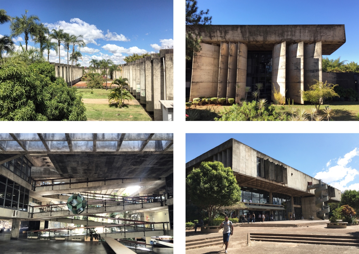
Biblioteca Central UnB | José Galbinski & Miguel Alves Pereira | 1969-1973 | Brasília | 04/08/2016

Restaurante UnB | José Galbinski & Antonio Carlos Moraes de Castro | 1969-1974 | Brasília | 04/08/2016

Instituto Central de Ciências (ICC) UnB | Oscar Niemeyer & João Filgueiras Lima (Lelé) | 1963-1971 | Brasília | 04/08/2016

Reitoria UnB | Paulo Zimbres | 1972-1975 | Brasília | 04/08/2016

The University of Brasília is situated in the North Sector of the city. The site was outlined in the city’s Masterplan, however, it was a struggle to secure its construction as some authorities did not want students interfering in the political life of the city. The University was however established in 1962 with the following key buildings of importance to the spread of Brutalism within the country’s new capital.

Biblioteca Central

An interesting feature of the library is the use of concrete in creating a monumental structure while having a sense of delicacy in the slender concrete bris-solei. This delicate use of concrete on the two main facades is contrasted by the heavy concrete blocks on the side elevation which have little connection with the rest of the building.

The bris-solei are positioned at different directions and angles which suggest a functional reason related to the use of the space inside, creating privacy and providing shading. The positioning of the bris-solei also marks the areas in which the building can be accessed and the areas which are impermeable.

Once entering the library, the building seems to lose its monumentality with a very average floor to ceiling height and a lack of height difference in key spaces or the foyer. The furniture and shelving are nothing special and overall the internal space does not live up to its exterior image. With two fully glazed façades, the effect of natural light is still insufficient and the space is lit artificially.

The building overall has some interesting architectural features and a strong, monumental aesthetic, however, the mishmash of scales between inside and outside do not come together, creating an underwhelming experience within.

Restaurante 

Food is very important in Brazilian culture with the main meal of the day being lunch, therefore, the restaurant is a key space in the campus and this is portrayed in its architecture.

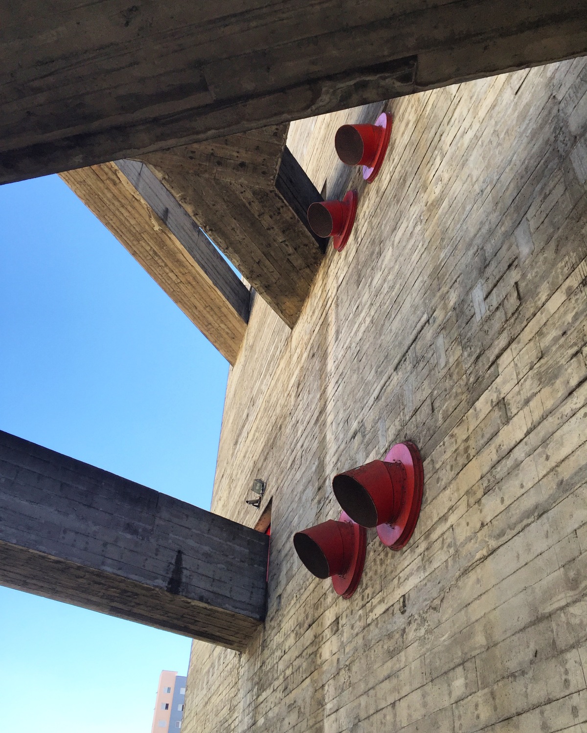
The landscaping and use of a slope in the site gives the building a differing sense of scale depending from where it is approached. The monumentality of the building is exaggerated by the concrete box overhanging the glazed walls, by a significant distance. The slab on the underside of the concrete box is continued through to the inside, which with the help of the glazing creates a strong connection between inside and outside.

Internally the building has 6 eating spaces, on three different levels. The space is socially interesting with large communal tables shared with students, professors and visitors eating together and at a very affordable price. The changes in height and offset levels internally create spatial differences between the eating spaces and the circulation and lobby space – which makes the eating spaces more intimate and allows the full height of the building to be appreciated from the lobby. The levels are connected through ramps which create an internal continuity and flow between spaces as well as becoming an extension of the lobby and a social space in itself.

Instituto Central de Ciências (ICC)

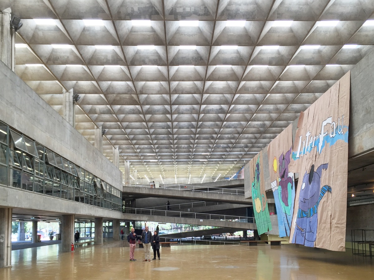
The Instituto Central de Ciências is the main building on the campus with several faculties and departments, cafes and other amenities housed within the two parallel structures. Different to the monumentality which is the result of an exaggeration of height; it is the length of the ICC (696m) and the use of a slight curve that creates a seemingly never ending building.

The building is introverted, ignoring the rest of the campus and focusing on itself, and has a difference in how its façade is treated internally and externally. The concrete structure is infilled with a metal grating externally, with access only at key points along its long façade. Internally the concrete structure is left open and is permeable with a central garden between the two structures. This creates varied degrees of inside/outside space and a strong connection between the building and nature.
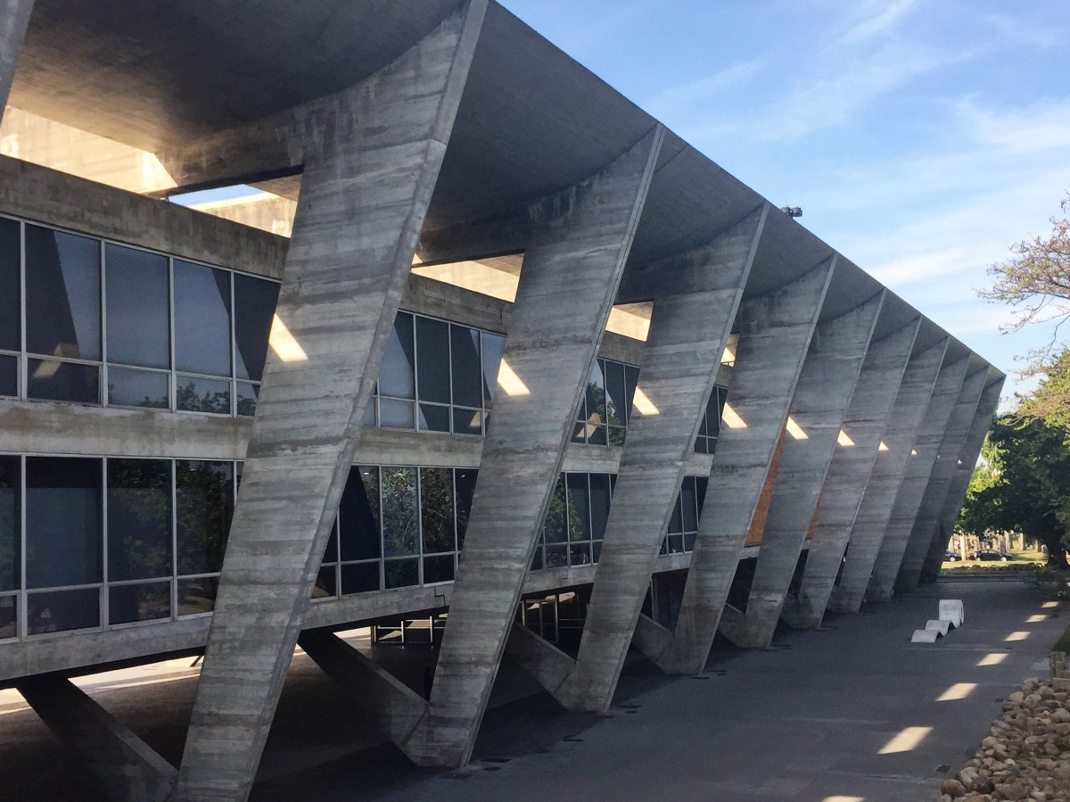
Reitoria 

Similar to the ICC, the Rectory creates a dialogue between inside/outside space, with its concrete lattice roof allowing the natural elements into the building, views out to the sky and hanging plants and planters provide greenery from the ground to the roof.

On approach to the building it reads as a flat façade but as you continue towards it the elevation is given depth as the levels overhanging each other and those set back become visible. The attention to detail is also apparent in this building with water drainage being used as an aesthetic feature – large concrete downpipes are cut short to make the water visible as it drops into landscaped bowls to drain away. The building is arranged on either side of the semi-enclosed space on offset levels, connected by ramps which provide a smooth transition through the building with a threshold only when entering a room.

The use of the space as private administration offices seems to contradict the openness and publicness of the building with large public spaces, in an architecturally rich space being seemingly underused.

Visit: Museu de Arte de São Paulo

Museu de Arte de São Paulo MASP | Lina Bo Bardi | 1957-1968 | São Paulo | 07/07/2016

The Museum of Art of São Paulo (MASP) designed by Lina Bo Bardi in 1968, sits on one of the city’s most important avenues, Avenida Paulista. The building itself consists of two parts: the hanging concrete and glass box; and the submerged volume underneath – with a public space sandwiched between the two.

MASP stands out on Avenida Paulista not just because of its vibrant red colour or its impressive unsupported span, but as a public space and a building that has a strong connection to the human scale and the ground plane, amongst a wall of high-rise skyscrapers. The public space is underneath a suspended mass of raw concrete, however the space feels open and unoppressive. The space is only private around the entrance to the museum with transparent fencing compromising the freeness of the space for functionality.

From the public space the building is entered through either two separate concrete stairwells, one for accessing the first floor and the other for accessing level -1, or a glass elevator which connects all of the spaces.

The open floor plan of the main galleries above is unconventional as it offers minimal wall-space to display works of art. Instead, one of the gallery spaces is inhabited by small clusters of hanging partitions that allows viewers to move through the space in various routes. The second gallery takes the freedom of movement even further with works attached to panels of glass fixed into the ground by heavy concrete plinths, giving the impressions that the paintings are floating and allowing the viewer to meander through the works in whatever route they like. (This layout was originally designed by Lina Bo Bardi, but was replaced in 1990, and only recently reinstated by a re-interpreted design by METRO Arquitetos.) The openness of the layout of art is carried through all aspects of the building as the journey through the building itself is optional in terms of the order of spaces to visit, both relating to a sense of freedom which is celebrated in the public space.

The gallery space draws attention to the works of art with white walls, white ceilings, white blinds, and white ventilation ducts, creating a canvas to exhibit the art. However, the clinical treatment of the galleries is contrasted with the raw and expressed materials and textures, as well as views to the outside, in the circulation spaces. The services in the circulation spaces are completely exposed with the raw concrete texture, of the exterior, sitting behind them. There is a sense of reality in the circulation space which connects the visitor to the outside as well as demonstrating what is needed for the building to function.

The other spaces of levels -1 and -2 have further gallery spaces as well as amenities (café, shop, library, restaurant). The lightness of the space is impressive as it is submerged below the public space but makes use of the slope in the site to have a fully glazed wall along its façade. The glazed façade is helped by artificial lighting from the white ceiling which evenly washes the space in light. The double-height open plan gallery of level -2 is surrounded by a walkway on level -1. These levels are connected by striking red stairs running in opposite directions, creating the focal point of the space.

When exiting the building from either of the stairwells the public space is re-introduced to you with different experiences from each exit. From below the heaviness of the concrete mass above is emphasised; whereas from above the vantage point of the whole space and impressive span can be appreciated.


Visit: Museu Brasileiro de Escultura

Museu Brasileiro de Escultura MuBE | Paulo Mendes da Rocha | 1986-1995 | São Paulo | 26/06/16

The Museu Brasileiro de Escultura MuBE was designed by Paulo Mendes da Rocha in 1995. The appearance of the building would suggest that it is Brutalist, however, due to being a building from the 90s, it is arguably not. By the end of the research I will have formed an answer to reason whether it is Brutalist or not…

The large spanning concrete mass defines the public space and is a marker of the buildings presence. The monumental form is supported by concrete blocks on either end, however, at the junction the concrete blocks leave a gap to reveal smaller columns which support the structure. The structural honesty demonstrates how the weight of the concrete mass is carried to the ground as well as expressing the concrete mass as its own form, distinguishing it from the columns at either end.

MuBE is as much a public space as it is a building with sculptures being exhibited both inside and outside, in two very different conditions. The public space is also used as a meeting place, with people either sitting out in the sun or sheltered underneath the shadow of the concrete.

The relationship between the building and public space creates a variation of forms and levels, which allow several routes to enter the building as well as offering countless vantage points of the most impressive sculpture – the building itself.

The juxtaposition of forms all share a similar colour pallet with tones of grey. However, the treatment of the surfaces begins to show differences and subtleties; in the various finishes to the concrete surface; the square concrete floor slabs; and the ‘pedra portuguesa’.

These grey forms result in creating a monumental mass with little connection to the human scale. This monumentality is contrasted through a tactile human contact of the steel handrail with its curved form and intricate joints.

The play between positive and negative is interesting in the forms of the building; with the negative form of the public space being full of human activity; contrasted to the positive mass of concrete which is uninhabited.

Throughout the building the services are treated with varying degrees of revelation with grids semi-concealing the services in the gallery spaces, fully exposed ductwork in the toilets and large openings to the underside of the concrete beam exposing artificial lighting and wiring.

Within the gallery space natural light washes the back wall and comes through the glazing, navigating the viewer through the space, where controlled artificial lighting is used for the exhibits. The concrete forms of the building are activated by the sunlight with extremes of light and shadow on the surface, changing throughout the course of the day.